Change is a funny thing. It’s constant, inevitable - but it doesn’t necessarily happen overnight.
The author C.S. Lewis is often quoted as saying: “Isn't it funny how day by day nothing changes - but when we look back, everything is different?”
Take a moment to think about the websites you’ve seen throughout the last few months. You can probably think of a handful that stuck out to you based on their user-friendly interface and appealing layout.
The same goes for the websites with a terrible user experience - they stick with you and might even leave you with a negative feeling about the brand.
In this article, you will learn about seven web design trends in 2020 that can give you a competitive edge.
Combinations of filled and outline typography (often in the same typeface) are in full effect. The trend features typography duos with and without interactive features.
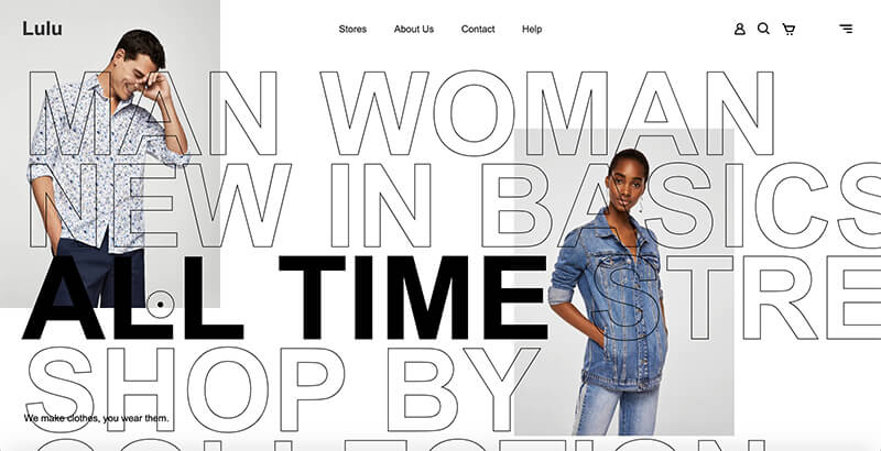
This example above uses filled text as a hover state to cue users that the element is clickable. Outline states are for non-hover elements.
The results are super interesting and create a fun typographic effect that can be used in plenty of different ways. Plus, it makes font pairing a breeze since one font is used in two different ways.
One of the most interesting website trends of 2020 is the use of website scroll animations. Keeping users engaged on a simple, static landing page is nearly impossible. Adding responsive design trends like web animation and interactive elements to a landing page makes it more interesting and keeps users engaged on the page longer.
This type of web design showcases visual design talent and front-end development skills, and it also increases time on page and engagement.
Microinteractions let the user feel what they're doing. They bring a site to life! They let the user interact on a level that feels tangible and palpable. The user gets instant feedback, direction, and emotional validation.
As long as the animations don’t take away from your goal or confuse users, this 2020 web design trend can be a highly effective way to make it easier for users to convert.
Mobile-first is a design strategy, while it may use a mobile responsive framework, it considers mobile users’ needs first and foremost.
It's a trend that is quickly moving away from trend status towards good practice in web design. Every year, more people are looking at websites on their phones rather than on desktops. That’s why developers and designers are quickly moving towards designing for mobile-first.
Mobile websites have been an afterthought for years. Yet, 52.64% of all internet traffic happens on a mobile device.
Another trend I’ve been seeing grow through the year and will surely grow in 2020 is the use of vertical split sections. This trend is used to create two separate info sections in the same space. In some cases, the vertical split is used throughout an entire site or only in some sections.
When Instagram rebranded in recent years, people definitely noticed the new gradient logo. It was so different from the popular style at the time, but their decision to modernize gradients impacted design as a whole. Gradients have now become more popular among creatives when searching for new website design inspiration.
I expect to see more and more gradients incorporated in new website designs in the next year, among other 2020 website design trends.
You might think of this website design trend as interactive Legos. These designs feature interactive elements that use three-dimensional shapes or gamification to get you to engage more deeply with content. It’s a good way to get users to stay with the design for a longer period of time and provides a lasting impression.
The 3D design comes in many shapes and forms. What I started seeing in 2018 and 2019 were elaborate three-dimensional illustrations. The trend has moved to more straightforward and less flashy designs. Three-dimensional designs are used for text sections, photo galleries, services pages, product photographs, and much more.
After making waves in mobile operating systems and interfaces, dark mode is finally made its way to our web designs. By maximizing the contrast ratio, it can enhance visual ergonomics while minimizing eye strain.
If you have an OLED screen, it truly shines as it can turn off all the pixels to give you a pitch-black look. By turning off some pixels, you can save power and can also prolong the life of your screens. What’s more, it can truly bring other elements and colors to life, thanks to the dark background.